Storytelling with Data
Summarize book `Storytelling with Data`
In this blog I will summarize the book Storytelling with data, which a complete guide for telling a story with data.
This book includes 6 lessons:
- Understand the context
- Choose an appropriate visual display
- Eliminate clutter
- Focus attention where you want it
- Think like a designer
- Tell a story
Befor you begin down the path of creating a data visualization or communication, attention and time should be paid to understanding the context for the need to communicate.
Exploratory analysis is what you do to understand the data and figure
out what might be noteworthy or interesting to highlight to others.
When we do exploratory analysis, it’s like hunting for pearls in oysters.
Here, we focus on explanatory analysis and communication.
Who - Who you is your audience and how they perceive you?
What - What do you want your audience to know or do?
How - How can you use data to help make your point?
The 3-miute story iss exactly that: if you had only three minutes to tell your audience what they need to know, what would you say? This is a great way to ensure you are cleear on and can articilate the story you want to tell.
- It must articulate your unique point of view;
- It must convey what’s at stake; and
- It must be a complete sentence.
There are only a dozen different types of visual we will focus on this chapter.
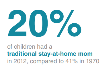
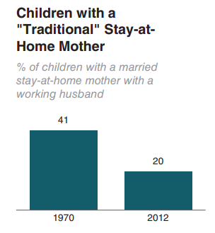
When you have just a number or two to share, simple text can be a great way to communicate.
Do this
 Not this
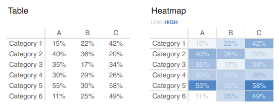
If you need to communicate multiple different units of measure, this is also typically easier with a table than a graph.

Borders should be used to improve the legibility of your table. Think about pushing them to the background by making them grey, or getting rid of them altogether. The data should be what stands out, not the borders.
A heartmap is a way to visualize data in tabular format, where in place of the numbers, you leverage colored cells that convey the relative magnitude of the numbers.
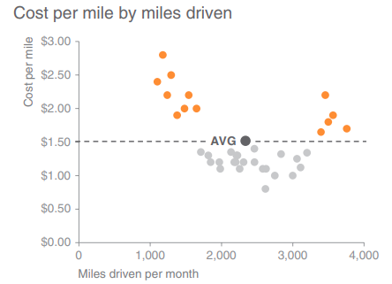
Scatterplots can be useful for showing the relationship between two things.
Line graphs are mots commonly used to plot continous data. It can show a single series of data, two series of data, or multiple series.

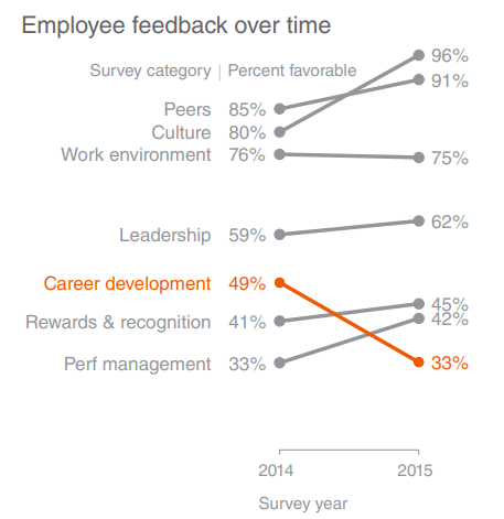
Slopegraphs can be useful when you have two periods or points of comparison and want to quickly show relative increases and decreases or differences across various categories between the two data points.
